

I like making banners. I do sketching sometimes too, but not nearly as often. I guess this'll be my art thread. xD
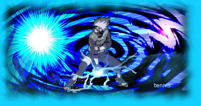
I'm a big narutotard. lol.
Older banner that I made for a site I help run.
Banner made for my wifi trade partner. (arkeis.com is credited for the render)
REALLY old lol. I made this for someone in wifi as well, but that was when I was still getting used to GIMP effects.
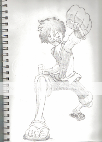
A sketch that i did. :) Luffy is awesome.
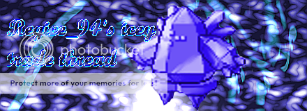
Kind of average wifi banner that i made for somebody.

Really basic sig that I made for a friend of mine.
One of my older banners made while I was still discovering some of the ways to use GIMP.
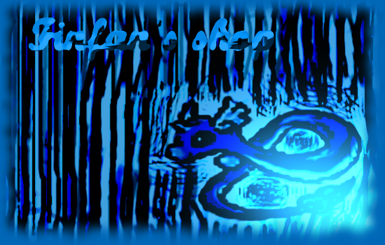
First sketch I did soley with GIMP. (man do you know how difficult it is to draw with a mouse? @_@)
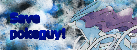
Lol, I made this when pokeguy in wifi was getting into trouble. xD More of a joke than anything. Decent banner though.
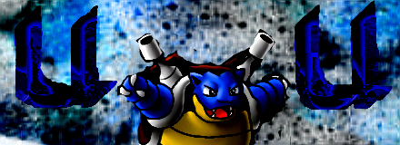
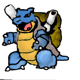
That's one of my more recent banners. Kind of nice. (arkeis.com is credited for the render. Most of the other pokemon banner renders can be found on pokemonelite2000.com before I spiffed them up)
Banner I made out of boredom for someone in wifi.
Another banner I made out of boredom for some random wifier. xD
Some random banner made for the same wifier as below. My personal favorite banner.
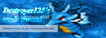
Bored and made a banner for another wifier. (I tend to do this a lot, mostly when i can't stand their current banners...)
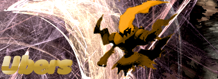
http://i357.photobucket.com/albums/oo16/tennisisawesome/Uberbanner.png[img]
Made for the same wifier. [B][SIZE=4]PLEASE GUYS DO NOT RE-USE THESE BANNERS! IF YOU WANT A BANNER I WILL MAKE YOU A DIFFERENT ONE![/SIZE][/B]
[SIZE=2][IMG]http://i357.photobucket.com/albums/oo16/tennisisawesome/GI-2.png[/SIZE]
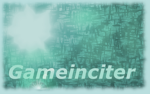
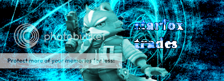
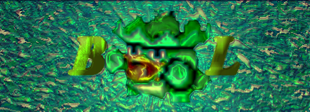
Another banner I made to advertise gameinciter; the site that some friends and I run.
Banner made for a wifier.
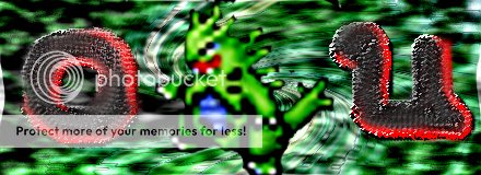
Wifier banner again. xD

Another banner made for wifi. Man I hate the colors in this... >.>
I have a lot more sketches, but the computer I saved them on is a different one. If I get on it, I'll upload some more. The other places my art is uploaded too isn't able to link here and show, so when i get time I'll put them on my photobucket. Basically, I'm willing to make anyone a banenr if they provide me with a render and what they want it look like. (it must be appropriate though, ofcouse... )

I'm a big narutotard. lol.

Older banner that I made for a site I help run.

Banner made for my wifi trade partner. (arkeis.com is credited for the render)

REALLY old lol. I made this for someone in wifi as well, but that was when I was still getting used to GIMP effects.

A sketch that i did. :) Luffy is awesome.

Kind of average wifi banner that i made for somebody.

Really basic sig that I made for a friend of mine.

One of my older banners made while I was still discovering some of the ways to use GIMP.

First sketch I did soley with GIMP. (man do you know how difficult it is to draw with a mouse? @_@)

Lol, I made this when pokeguy in wifi was getting into trouble. xD More of a joke than anything. Decent banner though.

That's one of my more recent banners. Kind of nice. (arkeis.com is credited for the render. Most of the other pokemon banner renders can be found on pokemonelite2000.com before I spiffed them up)

Banner I made out of boredom for someone in wifi.

Another banner I made out of boredom for some random wifier. xD

Some random banner made for the same wifier as below. My personal favorite banner.

Bored and made a banner for another wifier. (I tend to do this a lot, mostly when i can't stand their current banners...)
http://i357.photobucket.com/albums/oo16/tennisisawesome/Uberbanner.png[img]
Made for the same wifier. [B][SIZE=4]PLEASE GUYS DO NOT RE-USE THESE BANNERS! IF YOU WANT A BANNER I WILL MAKE YOU A DIFFERENT ONE![/SIZE][/B]
[SIZE=2][IMG]http://i357.photobucket.com/albums/oo16/tennisisawesome/GI-2.png[/SIZE]
Another banner I made to advertise gameinciter; the site that some friends and I run.

Banner made for a wifier.

Wifier banner again. xD

Another banner made for wifi. Man I hate the colors in this... >.>
I have a lot more sketches, but the computer I saved them on is a different one. If I get on it, I'll upload some more. The other places my art is uploaded too isn't able to link here and show, so when i get time I'll put them on my photobucket. Basically, I'm willing to make anyone a banenr if they provide me with a render and what they want it look like. (it must be appropriate though, ofcouse... )


