

Since (iirc) roughly the beginning of the generation, the tier selection for a teambuilder has been wildly inconvenient at best and unusable/unintuitive for new players at worst. With a computer screen of dimensions 1882 x 1036, far larger than your average laptop for instance, fails to come close to covering every part of the tier list in the builder as seen here.
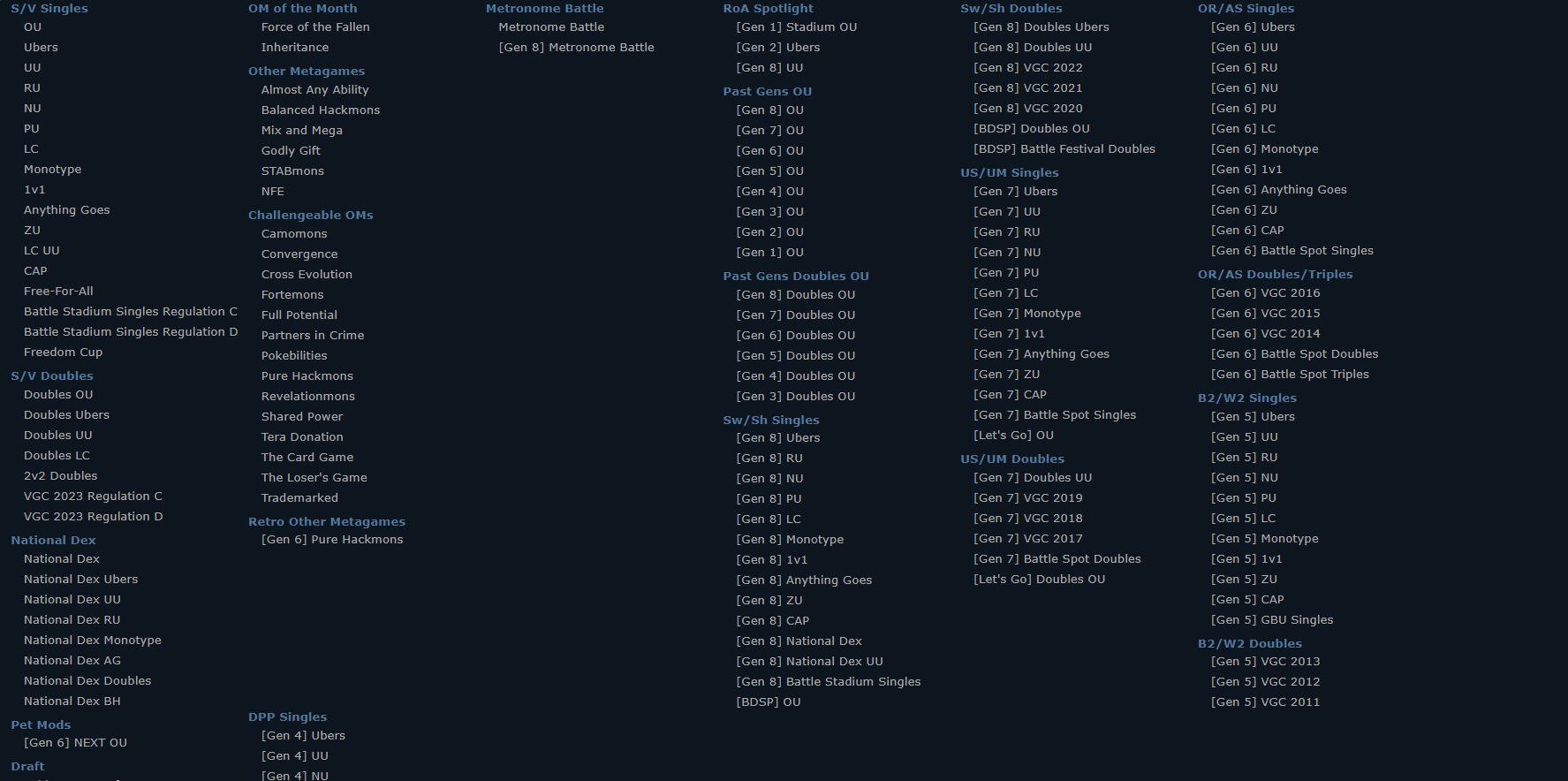
Suffice to say this is ugly and lacks any form of cohesion, with the random globs of dead space. I understand it was a low priority when the generation came out, coding in proper mechanics, maintenance, the sprite project, and doing hotfixing on elements like Photosynthesis's took center focus. Now, the dust is mostly settled and exams should be gone for any staff who has it, so I think it's as good a time as any to fix it.
How to fix it? Well, a start would be a search bar, similar to the builder where you can search a Pokémon's name, allow this for tiers inside the builder as well and this can save a lot of hassle, and is generally the easier of these to implement I imagine. As for compacting the images above, Collapsible columns for each generation would future proof so this issue doesn't re-arise in the future, similar to the hide feature on the forums in practice. (It's also worth noting some metagames simply are not present entirely and require a fairly roundabout method to properly categorize, such as SS National Dex Monotype and older gen NFEs which just isn't ideal, so their reintroduction would be appreciated)
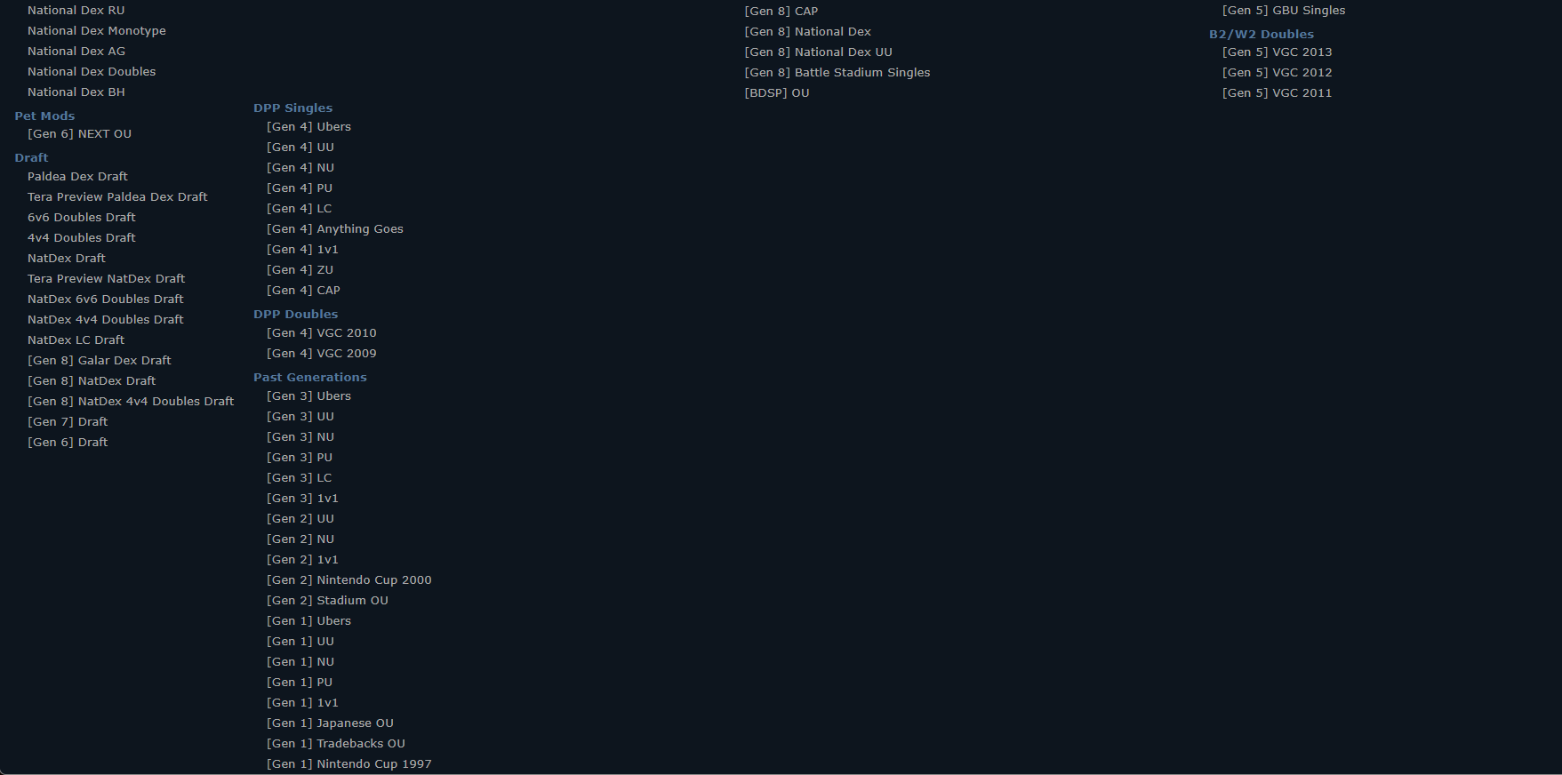


