I would suggest moving the settings button from
 the top corner to maybe under
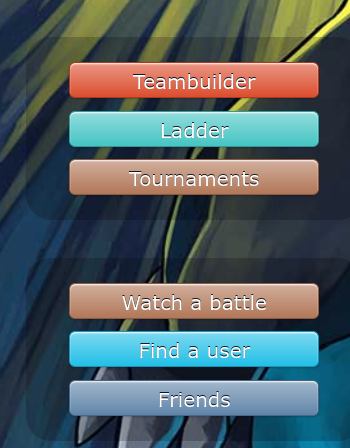 as other wise i think there is a chance that people will miss it as it is small and out off the way i think we should keep the
 just without settings so just in this imagie it would be
 thanks for your time and sorry if this is hard to understand lol

-
The moderators of this forum are the Pokémon Showdown! Administrators.
-
Welcome to Smogon! Take a moment to read the Introduction to Smogon for a run-down on everything Smogon, and make sure you take some time to read the global rules.
-
View the suggestions ordered by popularity here.
-
Congrats to the winners of the 2023 Smog Awards!
Rejected moving the settings button
- Thread starter DMPenguin
- Start date


