
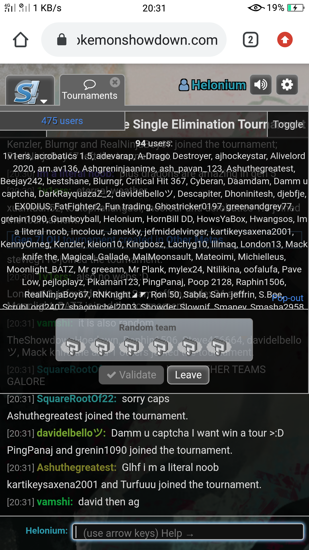
As you can see in the image attached, the active user panel has hidden the tournament's name. Its a pain for mobile users like me that we cannot know what tournament is it without joining or asking in the chatroom. I suggest that the active user panel should be either made transparent or smaller. It doesn't need to be that big for showing small numbers like 475.

-
The moderators of this forum are the Pokémon Showdown! Administrators.
-
Welcome to Smogon! Take a moment to read the Introduction to Smogon for a run-down on everything Smogon, and make sure you take some time to read the global rules.
-
View the suggestions ordered by popularity here.
-
Congrats to the winners of the 2023 Smog Awards!
Rejected - Inactive Make the active user panel either transparent or smaller(in mobile devices)
- Thread starter Helonium
- Start date