
QuentinQuonce
formerly green_typhlosion
All this talk of Colosseum/XD shinies in another thread reminded me that I saved a page a while back containing a bunch of Gamecube shinies mocked up as GBA sprites. Didn't title the bookmark, though, did I? So I just had to wade through every imgur page I've ever bookmarked... which is a lot. Lesson learned.
Anyway. The Gamecube games notoriously went off-model with the shiny colourations for several species. It's interesting that Genius Sonority were allowed to do that; there was a discussion on r/SilphRoad a while back about how much licence Niantic have to alter official Pokemon designs, since they're Nintendo's IP; the consensus was "not very". If anyone has any more information on this I'd be interested in learning more.
Genius Sonority really did a great job making some Pokemon look way better than they do in the main series, so I figured I'd do some side-by-side comparisons. Let's dive in! These are only a few of my favourites; credit to Polarbair on Imgur for the larger list, go check it out.
Quilava


Oh yeah. Starting off with an absolute corker. The green flames add a weirdly haunting beautiful edge to this, contrasting well with the slightly more vibrant red back colour. It's reminiscent of several other Fire-types whose flames turn more unusual colours when they're shiny; kind of puts me in mind of high school science classes where the teacher would throw all kinds of weird crap onto a Bunsen burner. Sadly Typhlosion does not retain this delightful palette once evolved.
Mr Mime
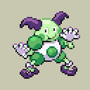

Fully committing to the green! I like this a lot, looks much more visually pleasing than the official shiny - the highlights are a more pleasant colour, and I hate the way the face on the latter clashes so strongly with the rest.
Suicune


The KING of altered shinies. I love that black mane so much, it's gorgeous! Suicune's official shiny is fine - good, even - but the GC version just pops. Bolder, more dramatic, suits the bleak and gritty world of Orre so much more.
Glalie


Eh, I'm not really super into either of Glalie's shiny sprites tbh but the pink gives it a bit more character. The original is... just kinda there, tbh.
Porygon2


Definitely prefer the GC model here. Not that the GBA version isn't good already, but the blue-on-blue makes it look so much more artificial and ethereal. Big upgrade (no pun intended).
Pelipper


Pelipper has grown on me a lot over the years. The difference between the GC shiny and the official shiny is less obvious here, but on the Gamecube proper you really notice it - the green tinge really makes the crest and wing tips stand out, and the darker beak just makes the whole thing pop in a way it didn't before.
Magcargo


A fairly small change, but I loooove this. It hearkens back to the original GSC shiny, which is much superior to the one from later generations. The deeper blue gives it a much more imposing presence (okay so it's a Magcargo, but you get me).
Masquerain


Agh, now this hurts me. Masquerain is quite possibly my favourite bug, and yet I detest the shiny we got for it. The yellow clashes so horribly with the green, and it just ends up looking incredibly unsightly. The GC model is much more restrained; it's a slightly off-colour version of the non-shiny form, which normally I'm not crazy about but it just about works here.
Slowbro


It's already a good shiny, but I love the additional green for the psychedelic tinge. Very fitting for a Psychic-type, after all. A lot of the shiny models in Colo/XD have that slightly radioactive look to them, like they'd glow in the dark. Slowbro is perhaps the standout example of this tendency and I am here for it.
Miltank


Miltank's official shiny is really good... after Gen 5 when they saturated it a bit. In Gen 3 it just looks washed-out. The GC version is cleaner-looking and a less sickly colour; more blue-grey than the icy blue we got, which works better with the black and white parts of its body. The red tinges on the official version make it look odd; much better the other way.
There are a few I'm less fond of, though (as is to be expected):
Corsola


Corsola's shiny is genuinely one of the most gorgeous in the entire series, I heartily dislike the GC model. Generally I prefer ones which go brighter/cleaner and this just feels like a washout; the purplish colour is less striking.
Camerupt


Definitely prefer the official shiny Camerupt, the black is just far cooler.
Sharpedo


I like Sharpedo's official shiny, but something about the GC version is just more appealing even though it's closer to the non-shiny standard. That ever-so-slightly different blue is just gorgeous on it, and gives it such a sharp, clean look against the white. By comparison, the purple makes the white and yellow sections look dull - still prefer it overall, though.
Anyway. The Gamecube games notoriously went off-model with the shiny colourations for several species. It's interesting that Genius Sonority were allowed to do that; there was a discussion on r/SilphRoad a while back about how much licence Niantic have to alter official Pokemon designs, since they're Nintendo's IP; the consensus was "not very". If anyone has any more information on this I'd be interested in learning more.
Genius Sonority really did a great job making some Pokemon look way better than they do in the main series, so I figured I'd do some side-by-side comparisons. Let's dive in! These are only a few of my favourites; credit to Polarbair on Imgur for the larger list, go check it out.
Quilava
Oh yeah. Starting off with an absolute corker. The green flames add a weirdly haunting beautiful edge to this, contrasting well with the slightly more vibrant red back colour. It's reminiscent of several other Fire-types whose flames turn more unusual colours when they're shiny; kind of puts me in mind of high school science classes where the teacher would throw all kinds of weird crap onto a Bunsen burner. Sadly Typhlosion does not retain this delightful palette once evolved.
Mr Mime
Fully committing to the green! I like this a lot, looks much more visually pleasing than the official shiny - the highlights are a more pleasant colour, and I hate the way the face on the latter clashes so strongly with the rest.
Suicune
The KING of altered shinies. I love that black mane so much, it's gorgeous! Suicune's official shiny is fine - good, even - but the GC version just pops. Bolder, more dramatic, suits the bleak and gritty world of Orre so much more.
Glalie
Eh, I'm not really super into either of Glalie's shiny sprites tbh but the pink gives it a bit more character. The original is... just kinda there, tbh.
Porygon2
Definitely prefer the GC model here. Not that the GBA version isn't good already, but the blue-on-blue makes it look so much more artificial and ethereal. Big upgrade (no pun intended).
Pelipper
Pelipper has grown on me a lot over the years. The difference between the GC shiny and the official shiny is less obvious here, but on the Gamecube proper you really notice it - the green tinge really makes the crest and wing tips stand out, and the darker beak just makes the whole thing pop in a way it didn't before.
Magcargo
A fairly small change, but I loooove this. It hearkens back to the original GSC shiny, which is much superior to the one from later generations. The deeper blue gives it a much more imposing presence (okay so it's a Magcargo, but you get me).
Masquerain
Agh, now this hurts me. Masquerain is quite possibly my favourite bug, and yet I detest the shiny we got for it. The yellow clashes so horribly with the green, and it just ends up looking incredibly unsightly. The GC model is much more restrained; it's a slightly off-colour version of the non-shiny form, which normally I'm not crazy about but it just about works here.
Slowbro
It's already a good shiny, but I love the additional green for the psychedelic tinge. Very fitting for a Psychic-type, after all. A lot of the shiny models in Colo/XD have that slightly radioactive look to them, like they'd glow in the dark. Slowbro is perhaps the standout example of this tendency and I am here for it.
Miltank
Miltank's official shiny is really good... after Gen 5 when they saturated it a bit. In Gen 3 it just looks washed-out. The GC version is cleaner-looking and a less sickly colour; more blue-grey than the icy blue we got, which works better with the black and white parts of its body. The red tinges on the official version make it look odd; much better the other way.
There are a few I'm less fond of, though (as is to be expected):
Corsola
Corsola's shiny is genuinely one of the most gorgeous in the entire series, I heartily dislike the GC model. Generally I prefer ones which go brighter/cleaner and this just feels like a washout; the purplish colour is less striking.
Camerupt
Definitely prefer the official shiny Camerupt, the black is just far cooler.
Sharpedo
I like Sharpedo's official shiny, but something about the GC version is just more appealing even though it's closer to the non-shiny standard. That ever-so-slightly different blue is just gorgeous on it, and gives it such a sharp, clean look against the white. By comparison, the purple makes the white and yellow sections look dull - still prefer it overall, though.
Attachments
-
 1.2 KB Views: 29
 -
 961 bytes Views: 30
Last edited:


