Smeargle's Studio Update
| « Previous Article | Home | Next Article » |
Introduction
Hey guys, it's ium here! It's been a little while since the last Smeargle's Studio update. Monthly Art Contest, or MAC for short, has been as great as ever with enthusiastic artists itching to win. Speaking of which, huge props to Danmire for stepping up and taking charge of organizing MAC! Smeargle's Studio artists have also been continuing their contribution efforts to the site through Art for Articles and Artwork for Tournaments, making Smogon's site much more visually appealing by the week. Finally, who could forget the arrival of new artists? They have had a great showing so far and are sure to continue to be exceptional contributors to this site.
This Smeargle's Studio update is going to feature the same ol' stuff a little differently. Alongside me I have two wonderful artists, Bummer and Danmire, who will provide commentary on the winning MAC entries and the new artists. My commentary will be depicted by the Pokémon Skuntank, Bummer's will be shown by Crawdaunt, and Danmire's will be indicated by Houndoom.
What's New in MAC?
MAC #19 - Summer
1st place – DEZTROYA
2nd place – Yilx
3rd place – nov
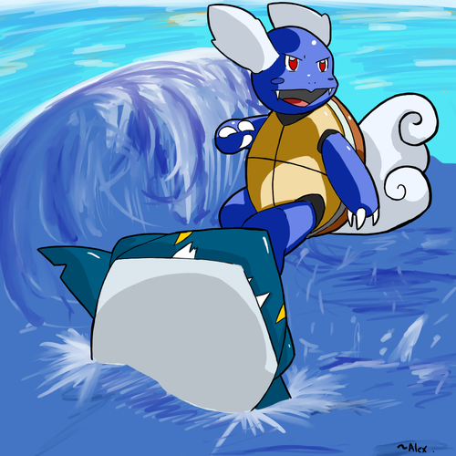
DEZTROYA really made work of the "warmness" of summer by using colors that are very pleasing to the eye. Blue is the main color in his piece and it's executed very well by him. The shades are just right where the wave is coming close and the highlights just as well where the sun is hitting Wartortle. Expressions are something that I love to see in pieces of work, and even a simple Pokémon like Wartortle was given this wide smile of fun. The anatomy is also perfect—very well deserved.
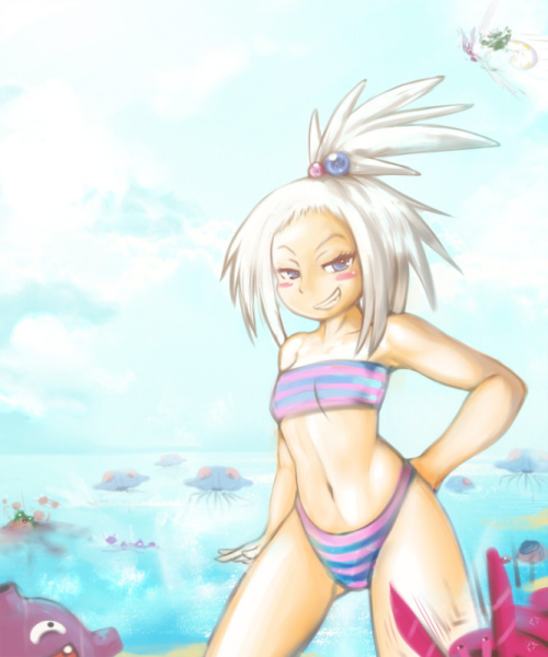
Yilx is one of my all time favorite artists on Smogon and for good reason. Not only did he manage to capture Roxie's features and all, but he really input the smug factor all the way to the core. Roxie clearly has an expression of a model that knows she's hot. The colors are bright and very pleasing, to which Yilx has blended them to perfection. The amount of detail in the piece is also something to take note of. You can tell that Yilx put a lot of time on the foreground, ala, Tentacruel and the others. Yilx put the "S" in both "Sexy" and "Summer", so congratulations to him.
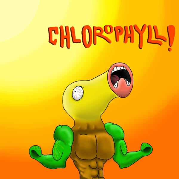
The piece by nov is a funny one to look at. nov may not have won first place, but you can bet that he won winner of the most dramatic face award. Now, Bellsprout is an ugly Pokémon. A VERY ugly Pokémon. This is where I give nov brownie points for making such an unappealing Pokémon look very amusing. Most Grass-type Pokémon would have to go through some form of photosynthesis, whether it's basking calmly in the sunlight or, as in nov's brilliant head, muscle-ripping, ab-showing, blood-shot looks while taking in the amazing power of the sun. One of my favorite parts of this is how he made the arms look as realistic as possible, but gave it hints that they are still plants. I'm not just talking about the color. Funny and charming piece, great job.
DEZTROYA captured a bit of the summer fun aspect with this piece by showing a Wartortle surfing on a Sharpedo. Instead of using warmer colors, DEZTROYA opts for cool colors as shown by the use of saturated, bright blues everywhere! I would have probably preferred to see a little more work on the water in this piece, but everything else is generally consistent and well-executed. The saturated blue colors not only make the piece vivid, but it also embodies the fun aspect of surfing and summer in general! It is definitely a well-deserved first place piece.
Meanwhile, Yilx opted to go for the cliché beach-during-the-summer theme. It may not be quite outside the box in terms of the concept and fitting the theme, but it's a solid and well-executed piece nonetheless. What I really enjoy are the soft colors that kind of mimic the glaring brightness of the sun that you would expect to see on a summer day at the beach. In addition, the finer details, such as the small highlights on the water and the Pokémon throughout the background (especially the silly Koffing and Dwebble in the corners), are amazing as one would expect.
And finally, innovative and quite odd, the piece made by nov was certainly a crowd favorite. While it may be lacking in the technical department, it makes up for that with the concept. Depicting the ability Chlorophyll, nov illustrates a Bellsprout absorbing the sun's light and gaining strength from it. The gradient of colors to represent the sunlight shows the extreme heat of the summer sun, while the exaggeration of the buffed-up plant adds to the humor as well. This is definitely not the first thing you'd think of when you see "summer," but it certainly does fit in a novel way!
In a true summer spirit, DEZTROYA decided to immediately jump the shark and use it as a surfing device, thus winning over a majority of the voter's hearts. The hard shading on Wartortle and the smooth background clashing against the cartoon figures reduce some of its prominence, but what it lacks in balance it compensates with content, encouraging each of us to embrace summer with a smile on our faces.
The runner-up made use of an approach we're more familiar with: sunny beaches, minuscule swimsuits and controlled sea pollution. Yilx's contribution is easily one of high quality, as the image is about as warm as the gentle rays of the sun we're inspired to face. Along with a good sense of lighting and a large number of Pokémon shown, it's no wonder why this piece got so close to the winning spot, and should not be treated any less for it.
Speaking of the sun, the user nov decided to make the best of it by powering up a Bellsprout to its full potential, announcing the arrival of summer in a magnificent display of strength and vigor. The behold of this energized plant is sure to both humor and motivate any individual who's still hesitating to leave their living quarters and brave the outside world, and seize the summer with a fierce expression adorning their faces. An easy winner of the third spot.
MAC #20 - Perspective
1st place – elcheeso
2nd place – MissVulpix
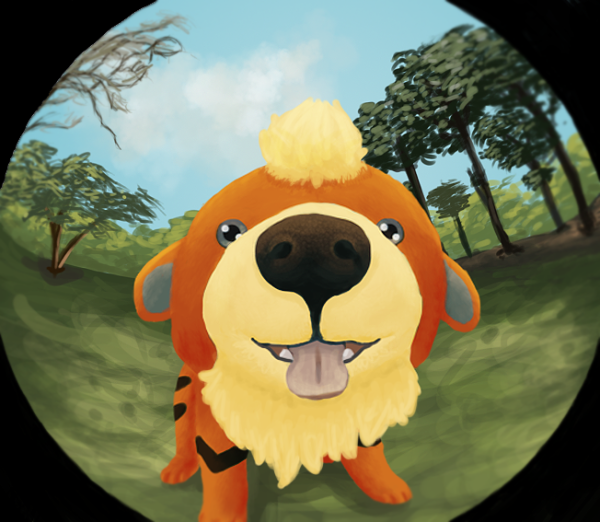
Out of the many things which can complicate a drawing and make any artist struggle, perspective remains as one of the more troublesome aspects. In that regard, elcheeso pulled a rather big stunt by not merely showing off a Pokémon in an unusual angle, but to also distort the surroundings with it to really illustrate that spyhole effect. While Growlithe's fur could have gotten some additional attention, the image is overall a great example of what this contest wanted to achieve, and its first spot is the direct result of that.
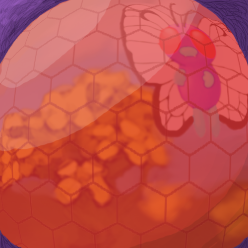
MissVulpix decided to get creative as well, by showing the reflection of a Butterfree on another Butterfree. By effectively removing the existence of the viewer entirely, we can safely observe Butterfree's compound eye and the sights it's currently viewing. MissVulpix still has some to learn when it comes to lighting on round objects, and the unusually flat surface of the eye also removes some of its brilliance, but this image is yet another example of what we were hoping to see in this round, and the voters had no problem rewarding her with a solid second place.
elcheeso won my heart by default. I am a huge fan of dogs, and so I'm giving major props to him for making a Growlithe look very modern. When I saw this piece, I ran to my backyard and did the same effect with my camera to my dog. It is very adorable. Like this piece itself. elcheeso used a very overused idea, but he wasn't lazy with it, oh no. Growlithe stands out and is very bright itself, and elcheeso made sure that the bright colors were picked up by the camera. The foreground colors gives a very nature-like feel, implying that the photographer loves the good outdoors (at least, in my point of view.) The anatomy captured by elcheeso is also spot on. You can see Growlithe's pores on it's wet nose, the sparkle in it's eyes. It's just adorable and I can't stress that enough.
The Butterfree piece was one that really caught my eye while I was looking at each contestant's work. MissVulpix used a very unique form of the theme itself. It's how an insect, or in this case Butterfree, sees the world. More or less, how we see the reflections. Since Butterfree, like most insects, has eyes that bulge out, the view is wider in the middle and grows gradually smaller around the edges of the eye. MissVulpix did a very good job with the full-shown Butterfree, with it's wings on the left hand side getting more obscured, and the wings on the right hand side popping out more. Very unique, two thumbs up from me.
elcheeso created a fine piece here; the brushwork is extremely detailed and thus creates a nice texture on Growlithe's nose and fur. Did I mention it's also adorable? There's no harm in showing perspective other than a cute dog up-front! My only other comment would be that the way elcheeso employed perspective in his work is a bit too obvious and expected; there were certainly other ways to approach this. Nonetheless, the piece is still a clear representation of the theme and is well-executed!
As for MissVulpix's piece, it is certainly creative. Similar to elcheeso's piece, this drawing also utilizes a convex lens for the perspective. However, this was shown through the compound eye of a Butterfree. The individual "eye units" are done well, but in my opinion, the red color of the eye is too dominant in the piece, making it difficult to view the smaller details such as the flowers. Had she introduced better lighting, MissVulpix could have probably pulled off the eye's roundness better and counteract the dominant and flat red color. Otherwise, this is an exemplary piece of art for this MAC's concept—definitely a concept I would never have thought of!
Contributions
Artwork for Tournaments
Started by Zracknel, the Artwork for Tournaments project has been going live since the end of August and has had a great output so far thanks to many contributing artists. Making use of the artistic talent lying around Smeargle's Studio, the project aims to provide artwork for each and every tournament hosted on Smogon. Artists, whether new or old, have been working diligently on new art assignments being posted as new tournament ideas are being concocted and placed on queue on a regular basis. To no surprise, the fast yet hard-working Bummer has already contributed a total of four pieces of artwork which have all been used in tournaments! Juicy Fruit, elcheeso, and Scepticallistic deserve honorable mentions too as they have each had at least two of their pieces featured on these competitive battlegrounds. Kudos to these four for an outstanding showing so far! However, these are only a tiny bit of the handful of artists drawing for Artwork for Tournaments who deserve so much credit.
Being a project that welcomes numerous submissions from any artist for a single tournament, Artwork for Tournaments does need to enforce some quality control when deciding which artwork to feature. However, this shouldn't dissuade people from trying to contribute! Drawing for this project and having art used for several tournaments can eventually lead to a fancy little Artist badge for one's postbit. Just look at how elcheeso got his badge (congratulations, by the way)! And to an even bigger surprise, you don't even need to be an artist to help out with this project! Thorough and consistent criticism for submitted pieces over a period of time can also lead to a Community Contributor badge. Thanks to the Smeargle's Studio community, the project has been a success so far (and will continue to be) and I am sure that Zracknel is proud. For those looking to start helping out, don't be shy. Just stop by and start drawing—have fun while you're at it!
Art for Articles
Besides the various Pokemon analyses that can be found on this site, Smogon also houses many articles about anything from battle advice to game mechanics. For a long time, these written pages have been without illustrations, but for the few past months, this has gradually begun to change! With the initiative of macle and fireburn, the Art For Articles (A4A) thread in Smeargle's Studio aims to utilize the subforum's vast potential in order to supply all on-site articles with images that are just as stylish as they are informative. You heard me. All articles. Meaning that anyone who believes that their art is good enough to decorate the walls of Smogon are welcome to contribute with pictures of their own design, where prominent artists are rewarded with artist badges for their esteemed endeavor.
Naturally, in the same manner art is provided for The Smog webzine, not all contributions may be accepted based on their quality or content, but this comes with the territory. We sincerely hope this won't discourage anyone from contributing to this cause, and anyone who finds themselves with a rejected submission is always welcome to resubmit if the image has been improved to satisfaction. As with most community projects, the A4A thread got a large interest from the forum members at its birth, which gradually decreased once it got settled in. Compared to all the other community threads in the studio, A4A does not have any particular deadlines to pay heed to, which could be one reason why its activity has stagnated over time. Its goal, however, remains as radiant as ever, and to this day we are still receiving art submissions from those eager to see the site well decorated. And remember: It's first come, first served, so if you want to see your art with your favorite Pokemon in it, you better act fast.
Now, it's time to turn the spotlight onto this month's featured artists!
Smogon's New and Upcoming Artists
ToxicPhox

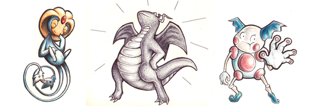
I never heard about ToxicPhox until two months ago, when she decided to show the studio what she's made of. Boy, are we happy about that. ToxicPhox manages to surprise us with her unlimited amount of imagination. I like to critique about anatomy and emotion, I really do, but when I critique about ToxicPhox, I don't have any complaints. The way she captures the Pokémon's expression is just too good for simple words. If you look at the Gengar in the picture above, you can feel the wickedness in the drawing itself. The smile, eyes, and that long realistic mouth give off a foreboding feel of something I can't really explain. Like lust mixed with terror. But a good terror, since it's smiling. The thing that I would also praise her for is the way she still manages to show us "it's this Pokémon, not that one", if you catch my drift. In her Walrien piece, you automatically think off the top of your head, "a realistic Walrein." That's the beauty of what's going in her mind! She manages to capture each specific piece of the Pokémon itself to a real world animal and blends it so perfectly it's unbelievable. The mustache on Walrein is spot-on with how it would look in the real world, but its noticeable feature is the gigantic mane. Very fluffy, just like a real Walrein. ToxicPhox is definitely a contender for Best New Artist, and I hope she sticks around with us for a long time and that she'll never stop surprising us. Go check out her thread here. It's like a wonderland of awesomeness.
CBMeadow
Most revered for her traditional artwork, CBMeadow really stands out from the rest. Her mixing of colors, along with the rough texture from using colored pencils, add dimension to her pieces. In addition, the pressure of her pencil strokes—shown by the variation in the lightness/darkness of her coloring—contribute to her wonderful shading while being very consistent with the shape of whatever she's drawing. Together, these different elements show her finesse and good eye for minor details. However, this isn't to say that she's a slouch in other areas; CBMeadow is improving in digital media as well! Similar to her traditional art, her digital work has presented great textural detail and a consistent palette of colors. Many of these drawings can be seen through her excellent work so far for the community, which include contributions to Arts for Articles and some CAP entries. Be sure to check out her art thread here to see more!
ium

ium started out in the NU district of Smogon, where he helped contribute art to the NU Hub, and has steadily expanded his territory ever since. With the use of clean lineart, vibrant colors, and amusing expressions, his art has gained the favor of numerous viewers, and he is now a proud contributor to The Smog as well. While his art and personality may be jovial, his dedication is entirely serious, where all of his artworks are accompanied with appropriate shading and highlights to add some extra flair to the pictures. All in all, he's a versatile artist with a knack for pulling off quick requests in a timely fashion, and a common sight on Smogon's IRC channels as well. For a closer look on ium, be sure to visit his artist profile, or head straight to his art thread in Smeargle's Studio to see his full arsenal of visual goodies.
| « Previous Article | Home | Next Article » |