CAP 11 CAP 11 - Art Submissions

Status
Not open for further replies.
Since people seemed to be pretty happy with the latest color scheme of my design, I decided to go ahead and color the original drawing with the same scheme. Keep in mind, I am still at a stage in which changing the colors is no big deal. If you have any suggestions please feel free to tell me about it. Well, here it is, the latest coloring of my design.


Also, if you didn't see my other sketch/color, please take a look. I would appreciate any and all criticism!


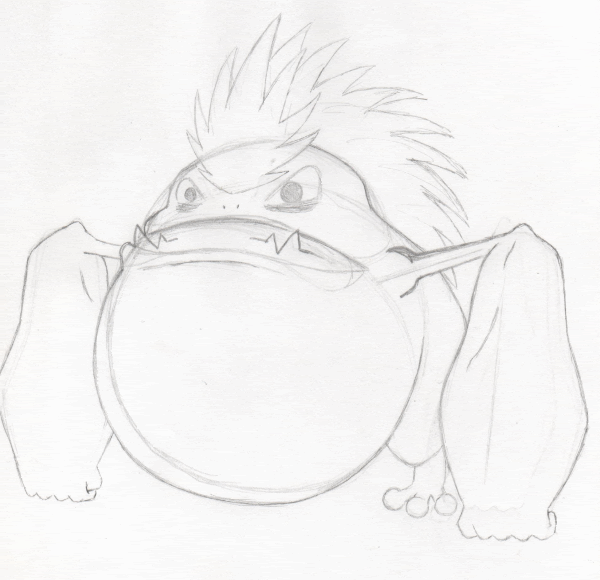
EDIT: Here is another quick piece of supporting art which places my design in a different pose. So far I'm pretty sold on the color scheme, and unless someone wants me to try something different, I'm going to stick to it. Thank you for all the support and comments thus far, I really appreciate them!

http://i731.photobucket.com/albums/ww313/MarceloSM/cap11extra.png
 
I'm really nervous about posting here as all the artwork so far has been amazing. I have been spending the last few days lurking trying to get u to par with this project and have been sketching in my spare time.

Rough: http://i139.photobucket.com/albums/q301/Kukem/Darklorisrough.jpg


I call it Darkloris. It's based on a Red Slender Loris with a bit of martial arts background. From what I can tell, this CAP looks more Special Directed so I opted to use a mystic orb in its palm. I'm working on colours and support poses now that I have this and it's pre-evo roughed out. (Needed to do a pre-evo to keep things straight!) Comments/Crits and Suggestions are greatly appreciated. I hope to become more active on Smogon now.

EDIT:

Supporting Pics added to this post. Not sure I like The character's main Colour scheme. May try a few more to see. Anyways, here are 3 moves: Dark Pulse, Focus Blast and Taunt as well as The Pre-evolution that I used to create my character. Sorry that they are links, but I can't seem to get the thumbnails down to the proper size restrictions.

Focus Blast: http://i139.photobucket.com/albums/q301/Kukem/DarklorisroughFCSBLST.jpg

Taunt:
http://i139.photobucket.com/albums/q301/Kukem/DarklorisroughTAUNT.jpg

Dark Pulse:
http://i139.photobucket.com/albums/q301/Kukem/DarklorisroughDRKPLS.jpg

Pre Evolution:
http://i139.photobucket.com/albums/q301/Kukem/PreEVO.jpg
 
Well, here's a quick little rough sketch of my idea-in-progress for CAP11.


Obviously it's still in the very preliminary stages right now and pretty unrefined so far, but I'm actually quite happy with how it's starting to look. This is my first CAP art submission since CAP3 and it feels good to get back into it.

I gathered most of the inspiration for this concept from giant toads, and attempted to stylize a design that incorporated a few Fighting- and Dark-type attributes. I've tried to keep it fairly simple for the most part, although I couldn't resist adding a little extra flair to the design by giving it a streak of hair.

I'm not completely satisfied with how the arms look currently; to me they look a tad too gorilla-like whereas I'm simply going for more of just the super-massive forelegs of a toad. It's an easy edit though. I'm also not sure whether I should incorporate toads' signature warts into the design as I'm afraid it'll turn out to look too much like a Poison-type. I also might see what it looks like without the hair and a different head-ornament in its place, or maybe even bald; I think it might look cool without the hair, maybe.

Overall, I tried to give the design a fair bit of utility as far as looking the part as per its stats. Offensively, I tried to shape it as though it could dish out fairly strong physical hits while still looking like it could fire off some strong special attacks as well. As far as defense goes, I attempted to give the design some bulk which could be seen as physically sound while that same bulkiness could also pass as being quite specially defensive too. So (hopefully) the design is flexible enough to fit whatever stat spread is chosen.

Anyway, thanks for reading. Any comments or criticisms are very welcome, please let me know what you think of it and how you think I might improve it! =]
 
You really don't want to mess with this mon...


Well, here's a quick little rough sketch of my idea-in-progress for CAP11.

Obviously it's still in the very preliminary stages right now and pretty unrefined so far, but I'm actually quite happy with how it's starting to look. This is my first CAP art submission since CAP3 and it feels good to get back into it

I gathered most of the inspiration for this concept from giant toads, and attempted to stylize a design that incorporated a few Fighting- and Dark-type attributes. I've tried to keep it fairly simple for the most part, although I couldn't resist adding a little extra flair to the design by giving it a streak of hair.

I'm not completely satisfied with how the arms look currently; to me they look a tad too gorilla-like whereas I'm simply going for more of just the super-massive forelegs of a toad. It's an easy edit though. I'm also not sure whether I should incorporate toads' signature warts into the design as I'm afraid it'll turn out to look too much like a Poison-type.

Overall, I tried to give the design a fair bit of utility as far as looking the part as per its stats. Offensively, I tried to shape it as though it could dish out fairly strong physical hits while still looking like it could fire off some strong special attacks as well. As far as defense goes, I attempted to give the design some bulk which could be seen as physically sound while that same bulkiness could also pass as being quite specially defensive too. So (hopefully) the design is flexible enough to fit whatever stat spread is chosen.

Anyway, thanks for reading. Any comments or criticisms are very welcome, please let me know what you think of it and how you think I might improve it! =]
I like the design itself. It maintains a sense of simplicity that pokemon designs should have. The problem I have with it though is that I am having a hard time finding the typing. I'm sure that the dark typing will come along with with the colors, but I really feel that you should make your design more fighting-ish.
 
After trying to sketch a wolf Pokemon and then trying to sketch a badger Pokemon, I came back and found ckp's design. It almost looks like he merged the two together and kicked my ass every which way at the same time. Fucking awesome job. Also, loving the Mayan panther idea. It's a bit simple, but with more detail, it could be my favorite.
 

Buffalo_Wings

Abnormally Cruel
is an Artist Alumnus
So many amazing designs oh my gooood


I haven't changed that much, but how does everyone feel about this colour scheme and my original emblem (yellow this time, I think it sort of looks like a moon or something, which is cool right???) I think this is pretty close to what my final design will be anyway.

I mainly posted to get opinions of my support work though, I tried to showcase the attributes it's probably gonna need for its stat spread.


P.s. that is supposed to be dark pulse haha
 
darkmattr said:
I want to point out yet another "amazing" concept. I have no bloody idea what it is supposed to be, but that is specifically why I love it so much. A lot of Pokemon are just quasi-humanshape things that are not founded in the animal kingdom (ie. Darkrai), but are exquisite in what they bring to the table. Your entry here is one of those. My only comment would be to sharpen its fingertips a bit so the edginess is more consistent throughout the entire piece. Definitely keep the hand wraps, though, they really scream the Fighting-type.
Swaggersaurus said:
I like this, too. I like how it takes the humanshape form and does it well, while still being pretty simple. I'm not a huge fan of the eye color or the scarf color, though. I think the eyes should be more like Lucario's and less monotone. I also feel like the scarf would probably look better in a more vibrant color to offset the light tons of the fur elsewhere. Something deep like red might give it more of a Dark-type feel as well, since right now it doesn't look the part of a Dark-type as well as some other entries. Other than this, though, I really like the concept and where you seem to be going with it.
 
@DougJustDoug:

Pokemon has done some pretty sinister stuff, most notably in the first generation. I wouldn't think a Jack the Ripper theme is that much of a stretch, and I definitely enjoy the design.

To illustrate, look at the article "On the Origin of Species: Paras and Parasect". Mind-altering parasitic fungus is definitely one of the most disturbing concepts to base a pokemon on.
 
Been lurking for a few days, and Buffalo_Wings has my favorite design by far.
It has like, a dark Xiaolin look to it. Which epitomizes dark/fighting, imo.

And it doesn't look too tough to sprite.
 
I'd like to say my favorites.
Paras's first design is my favorite, then Shazman, the wooden dummy and Jestler.

The first one from Paras looks a little like a ghost type, but I think the simple design and nice color choices shine here.

Shazman, I can really see working as a mixed attacker, supporting in any area your Togekiss set lacks, helping look the part. The flavor text and creative design is where this one shines.

The wooden training dummy is really neat. It does look a little creepy, and I think the bandages on it's arms help notify it's a fighting type. I'm not sure what to say, but it's really cool.

I'm not sure exactly why I like Jestler, but it's simple, and it works.
 
I'm also finding some of these designs a little hard to believe, especially because this CAP will be specially oriented. A big, fat, imposing wrestler just doesn't scream "Focus Blast!" over "Close Combat!".

So far, Wyverii's design is my favorite. It looks perfectly capable of ramming a Vacuum Wave or a Fire Blast down some poor Poke's throat. It LOOKS like a Special attacker. I also like Az's design for that reason.

Even so, good work everyone designing these. :)
 

LouisCyphre

heralds disaster.
is a Forum Moderatoris a Community Contributor
I'm leaning towards the more mixed ones -SEO's guardian and EvilSensei in particular - with badger sneaking his way in by looking awesome.

(After all, the most common Atk/SpA I've seen is around 80-90/100-105. But maybe that's poll jumping. D:)
 

az

toddmoding
is a Community Contributoris an Artist Alumnusis a Community Leader Alumnusis a Smogon Media Contributor Alumnus
loving doug's, nopie's and kukem's designs now too!

thanks for the feedback so far everyone

az da best imo the colours are origional, eye catching and fun. i could see racoon monster kicking some serious tail too, would use it in my OU team.

props boy
haha thanks very much! i like the colours too, but there are some changes i'll show you in a minutttte

I like this, too. I like how it takes the humanshape form and does it well, while still being pretty simple. I'm not a huge fan of the eye color or the scarf color, though. I think the eyes should be more like Lucario's and less monotone. I also feel like the scarf would probably look better in a more vibrant color to offset the light tons of the fur elsewhere. Something deep like red might give it more of a Dark-type feel as well, since right now it doesn't look the part of a Dark-type as well as some other entries. Other than this, though, I really like the concept and where you seem to be going with it.
thanks for such a detailed critique!

again re: colours, i'm about to post some changes i've made because i agree with you, there was a lot of light fur. i've reversed the colour scheme and i think it looks much better, giving an overall more cohesive feel of "ninja armour"

i specifically decided to avoid using red for the scarf because i felt it was a kind of cliché, and i can already see other designs in this thread with that going on (not to disrespect them at all; they've executed it better than i could!) and i've been experimenting with a deeper orange, but i haven't decided on anything yet. thanks for the heads-up though, maybe the more unified colour palette in the new version in this post (dropped the green, emphasised the yellow) will help?

i've been in pms with caladbolg~ (who has been a huge help!) and he favoured hiding the eyes to give the raccoon a more fox-like look, which will hopefully help with the dark theme. we haven't lost any of the yellow because the markings have changed too, but like i said i am still considering changing the scarf colours (and with them the facial markings), so i'll try to get some colour comparisons up soon

anyway, this is what i have thus far:


how are the colours working now? is the scarf still too light?

for those interested here's the process by which i revamped the facial features and a few other options, though i think the final looks best:

http://img829.imageshack.us/img829/4057/comparisonscopy.jpg

and the before and after when i first switched the colour scheme:

http://img835.imageshack.us/img835/672/tanukicolourcomp.jpg

much better, don't you think?

sorry for all that text!!

thanks again
 
Kukem: Your design is quite good so far. It captures the elements of both Fighting and Dark, without going over the top. Right now, the only thing it really needs is some supporting material so we can see how "Darkloris" fights. I can't wait to see this guy's Pre-evo.

DougJustDoug: That color scheme is a big improvement on your already good design. I only have two criticisms:
1) The white knife/claw stands out too much now that he's mostly tan. I'd recommend changing the claw's color to either tan or black.
2) The red necktie/neck handkerchief needs to go. For the most part, you manage to get the "organic clothes" feeling for RipJack. His "top hat" looks like a natural part of his head, the "cuff links" look like natural patterns on his body, almost everything in your design looks natural. But thanks to the red neckerchief, your "natural clothes" suddenly don't look organic. I have a feeling the overall art design will work much better without the necktie.
I hope I don't come off as too harsh. After all the only reason I'm giving so much feed back is because I really like this design! As I said, I'm looking forward to RipJack's backstory.

november1093: Ying-Yang panda FTW! So far your design concept is off to a great start! Some people are probably going to say "the bamboo automatically makes him look grass type", but that's cow crap! Farfech'd carries a leek, and it's normal/flying! But if I were you, I would take the leaves off the bamboo, to help people see that he's not grass type. You should also change the "rope" to something more organic, like a vine, or maybe a cord? Overall, CAP has yet another stellar design.
 
Oh woooow there are some freakin AWESOME designs here. Smogon is full of such wicked artists!

Caladbolg - The clown with the hand puppets rocks! Very very cool.
ckpmax - Both Badger and Rooster are extremely cool - I couldn't say I like either of them better, I just can't make up my mind.
Buffalo Wings - Love your evil sensei. Love it. I want one. Wicked colour scheme too - I wouldn't change it myself, but hey, maybe you'll think of something better.

Seeing as a I'm a brand new member, I better make my contribution to the community in this Ronin pokemon roughie I blatted out last night. It's very, VERY rough, I'm trying to think of ways to make it less clothes-y. Suggestions....?

EDIT: Oh woops best find out how to put an image on properly, huh. Typical noob
EDIT: Ok, figured it out. here's a link. http://img841.imageshack.us/i/roninpokemon.png/
Chur
 
I decided that since my oni wasn't receiving much attention, I should try a new design:


It is inspired a bit by kendo and shields and random things I know nothing about. I was thinking of something along the lines of Claydol- some kind of ancient relic or guardian of a gloomy temple. The only problem at the moment is deciding the coloration of it. :/
 
Anyway, after everyone completely ignored my previous post, I decided I should create a new one. This made this one. Obviously it is based on the punching Kangaroo.

 
Anyway, after everyone completely ignored my previous post, I decided I should create a new one. This made this one. Obviously it is based on the punching Kangaroo.
I think that it's a nice design so far, but I'm seeing more Fighting than Dark in its design. I don't know what to suggest though.
 
I had the same problem. I don't want to change it to a black Kangaroo just because the coloring would make it look so blotchy. Thats why I decided to add the smiley face in the back but I don't think it did very much.
 
Hey guys, thanks two people who commented on my training dummy Pokemon. Ya'll actually spurred me to save him for if something ever comes up later instead of just trashing the lump of a log. Because I'd at least like to have a submission, I figured I'd quick sketch one of my other ideas. I plan on painting him later. He's a kangaroo.


So Despairoo (pronounced kinda like Despero) is his name(WIP on the name), he's the Despair Pokemon (a complement to the Jubilee Pokemon of Togekiss). Despairoo is known for his strength and dirty tactics when fighting. With his strong tail, he can balance freeing up all limbs to fight. He's also know for using the boxing glove for Sucker Punches (think THIS POSE only with the tail turned upward over the head.

Further I should explain his look as this is a VERY ROUGH draft, done really quick to get the idea down so I wouldn't forget. First of all, as mentioned, he's a kangaroo. This was chosen since after looking at Togekiss, I realised that Kiss is VERY similar a Laughing Kookaburra (Google him, the fluff head and pudge body shouts Togekiss). Thus to choose his perfect mate, I figured choose another Aussie-based animal, and really, who hasn't heard of boxing kangaroos? They box dirty too. Despairoo groom the fur around their faces into a shape resembling a mask (like Crasher's) for intimidation. Different packs of Despairoo groom their masks into similar shapes and when differing packs meet, all hell can break loose as Despairoo keep long grudges. Despairoo's fur form terrifying faces on their backs and when not wanting to be disturbed they roll into a ball so that people and other Pokemon will not bother them.

So yeah, there's my updated try. All the fighting stereotypes are there, fingerless gloves, wrist whatnots (like Sabrina's), tape on the feet. Those are pads on his feet, and yes as mentioned, a boxing glove on his tail. I feel he's more fighting than my previous, and after I put the colour to him, the Dark side should be more prevalent. Any feedback would be greatly appreciated. Too busy? Not enough stuff to shout Pokemon? Want me to try a different pose? Just let me know.
 

Oglemi

Borf
is a Forum Moderatoris a Top Contributoris a Tournament Director Alumnusis a Site Content Manager Alumnusis a Community Contributor Alumnusis a Researcher Alumnusis a Tiering Contributor Alumnusis a Top Smogon Media Contributor Alumnusis an Administrator Alumnusis a Top Dedicated Tournament Host Alumnus
@Nopie - OMG your design reminds me of the toad thing on Jackie Chan Adventures.

I guess his name is Xiao Fung:
http://rclcorporation.sites.uol.com.br/imagens_recentes/d-xiao.jpg

I still love the design, it's my favorite so far, just the moment I saw it I was like, "holy crap that this is off of Jackie Chan Adventures!"lol

I don't think the forearms are too big, in fact, I think it gives him a certain menacing and intimidating character. And the hair, that's totally up to you. I would suggest a crown a la Slowking, but I like the hair too. Keep it up!! I can't wait to see it colored.
 
I don't really post too often during CAP (well, I don't post too much at all, clearly), but I have to throw my support behind az/Swaggersaurus' submission. I'm glad to hear you're not changing the scarf colour; I love the colour scheme you're using now (both are fine imo, although the second probably looks better overall), particularly because it doesn't make use of the cliched Dark-type purple, dark red, black, etc. You've definitely got my vote~ ^^
 
@Swaggersaurus: Sorry, but your design looks a lot like Lucario. I think it has potential, but if cpkmax1108's rooster supposedly looked like Blaziken (which I disagree with), then I think this one definitely looks like Lucario.

@SEO: Still looks good, but liked the first color scheme better personally. Although now it looks less like Fourarms from Ben 10 :P

@aragornbird: I have to say I liked your panther better without the crown.

@kukem: Okay, your guy looks INSANELY awesome. However, I think it looks more like a steel type than a dark type. If you can find a way to fix that, my vote is yours.

@Graffn Trix: Pinsir isn't dark or fighting type, why would it lose its bug type through evolution...?


Kind of did a design about face. Don't worry, that last design will get recycled at some point. I like Lions too much for it not to.

I actually was inspired for this by an anime called Working!! If any of you have watched that through there is this one episode were a character is wearing a japanese style demon mask. I made me feel like drawing, and this is what I drew =P. HAD to keep that smiley faced tail though. I just couldn't get rid of the giraffirig reference. He needs some love, and an Evo.
 
Status
Not open for further replies.

Users Who Are Viewing This Thread (Users: 1, Guests: 0)

Top